Kings Rift · Design system v0.1
Styleguide
The living reference for the Kings Rift website. Every swatch, type style and component on this page is rendered from the real tokens and components, so what you see here is what ships.
Principles
01
Two worlds, one seam
Compositions split into ember (Dragons) and arcane (Knights), joined by a thin violet rift. Keep the seam narrow and bright; never let the two colours blend into mud.
02
Forged, not rounded
Surfaces are chamfered metal plates with thin gradient edges. No pills, no soft blobs. Circles are reserved for emotes and sigils.
03
Gold is the neutral
UI chrome, borders and primary actions are gold. Faction colours only appear on faction content, so they keep their meaning.
04
Serif for legends, condensed for UI
Cinzel carries titles. Barlow Condensed in tracked caps labels the interface. Barlow sets everything you read.
05
Motion with weight
Things settle rather than bounce. Slow reveals, fast feedback, ambient loops kept subtle. Everything respects reduced motion.
06
Copy that plays
Short, confident lines in the second person. Chess facts stay precise; the drama goes in the verbs, not in the claims.
Logo & emblem
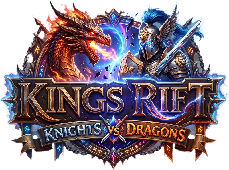
Primary logo
Use on dark backgrounds only (ink-950 or darker, or the hero atmosphere). Minimum width 240px on screen; below that, use the emblem with the wordmark. Keep clear space equal to the height of the "VS" medallion on every side. Never recolour, outline or place it on a light background.
Files: public/images/kings-rift-logo.webp (1312px) and kings-rift-logo-800.webp.
Emblem · 96 / 56 / 32 / 20
Header lockup
Emblem
A forged shield split by the rift under one crown. It is the favicon, the header mark and the app-icon starting point. Source: components/ui/Emblem.astro and public/favicon.svg.
Colour
Primitive tokens (--kr-*) define the palette. Components use semantic tokens only, so a seasonal re-skin is a token override.
Ink
Backgrounds & surfaces
--kr-ink-1000--kr-ink-950--kr-ink-900--kr-ink-850--kr-ink-800--kr-ink-700--kr-ink-600--kr-ink-500
Ash & Bone
Text
--kr-ash-500--kr-ash-400--kr-ash-300--kr-ash-200--kr-ash-100--kr-bone-100--kr-bone-50
Gold
Brand neutral: chrome, borders, primary CTA
--kr-gold-800--kr-gold-700--kr-gold-600--kr-gold-500--kr-gold-400--kr-gold-300--kr-gold-200
Ember
Dragons of the Caldera
--kr-ember-800--kr-ember-700--kr-ember-600--kr-ember-500--kr-ember-400--kr-ember-300--kr-ember-200
Arcane
Knights of the Realm
--kr-arcane-800--kr-arcane-700--kr-arcane-600--kr-arcane-500--kr-arcane-400--kr-arcane-300--kr-arcane-200
Rift
The seam between worlds. Use sparingly
--kr-rift-700--kr-rift-600--kr-rift-500--kr-rift-400--kr-rift-300--kr-rift-200
Semantic tokens
--color-bgPage background--color-surfaceCards, panels--color-surface-raisedHovered / raised surfaces--color-headingHeadlines--color-textBody copy--color-text-mutedSecondary copy--color-accentBrand accent (gold)--color-dragonsDragons faction--color-knightsKnights faction--color-riftRift accent--color-border-strongEmphasised borders--color-focusFocus ring
Gradients
--gradient-gold--gradient-gold-edge--gradient-ember--gradient-arcane--gradient-rift--gradient-steel
Faction scopes
Set data-faction="dragons | knights | bonebound | rift" on any element and faction-aware components inside it recolour automatically.
data-faction="dragons"
data-faction="knights"
data-faction="bonebound"
data-faction="rift"
Typography
Aa
Cinzel
--font-display · 600–900. Titles, taglines, faction names. Title Case or ALL CAPS via the font's small caps; never for paragraphs.
AA
Barlow Condensed
--font-ui · 500–700. Buttons, eyebrows, labels, HUD details. Always uppercase with 0.14–0.34em tracking.
Aa
Barlow
--font-body · 400–600. Everything people read. 1.65 line height, 65ch max measure.
Kings Rift
Every capture
Two armies
The captures are war
Ranked seasons
A cinematic duel on every capture.
The rules of chess stay exactly as they are.
Ranked clocks allow for the show.
Legal notices, captions
Text styles
.t-eyebrow — section kicker
.t-lead — introduces a section in one or two sentences.
Body — Barlow at step 0. Keep paragraphs short; this is a game site, not a manual.
.t-muted — secondary information.
.t-ui — interface label
Space & layout
Fluid spacing scales smoothly between a 360px and a 1440px viewport. Use tokens, never raw pixels, for layout gaps.
--space-3xs--space-2xs--space-xs--space-s--space-m--space-l--space-xl--space-2xl--space-3xl
.container76rem max, fluid gutters.
.container--wide90rem. Header, hero chrome, full-bleed panels.
.container--narrow46rem. Long copy, centred CTAs.
.sectionVertical rhythm via --section-pad-block.
.stack / .cluster / .grid-autoLayout primitives, configured by custom properties.
.bevel / .grainChamfer any box; add film grain to flat gradients.
Shape & light
--bevel-s--bevel-m--bevel-lPlate edge--glow-gold--glow-ember--glow-arcane--glow-riftComponents
Button
components/ui/Button.astroOne primary per view. Labels are verbs in 1–3 words. Pass href to render a link.
Store badge
components/ui/StoreBadge.astroDriven by stores in src/config/site.ts. When a listing goes live, switch to the official Google Play / App Store badge artwork as their brand guidelines require.
Tag & ornament
Tag.astro · Ornament.astroSection heading
components/ui/SectionHeading.astroEyebrow
Title with a highlight
Lead paragraph in the default slot. One or two sentences that set up the section.
Plate
components/ui/Plate.astroGold (default)
Base card surface. Hover lift with interactive.
Faction
Edge and corner glow follow data-faction.
Quiet
For dense or nested content.
Video frame
components/ui/VideoFrame.astro
Placeholder until you pass youtubeId (loads youtube-nocookie on click) or src + poster (native video). Layout never changes.
Icons
24px grid. Line icons use a 1.75 stroke; solid icons are silhouettes. Add new ones to components/ui/icons.ts.
Motion
Easing
--ease-outDefault. Fast start, soft landing: reveals, hovers.
--ease-in-outLoops and symmetric moves: floats, pulses.
--ease-snapSlight overshoot for small UI pops: icons, chips.
--ease-strikeWind-up before an impact. Pair with a quick follow-through.
Duration
--dur-instant | 90ms | Press feedback |
--dur-fast | 180ms | Colour, underline |
--dur-base | 320ms | Most hovers |
--dur-slow | 700ms | Scroll reveals |
--dur-epic | 1200ms | Hero entrances, panel expands |
Scroll reveal
Add data-reveal (optionally ="left|right|scale|blur"). Wrap siblings in data-reveal-group to stagger. Reduced motion shows content immediately.